Author chooses MGC for photography and book production.
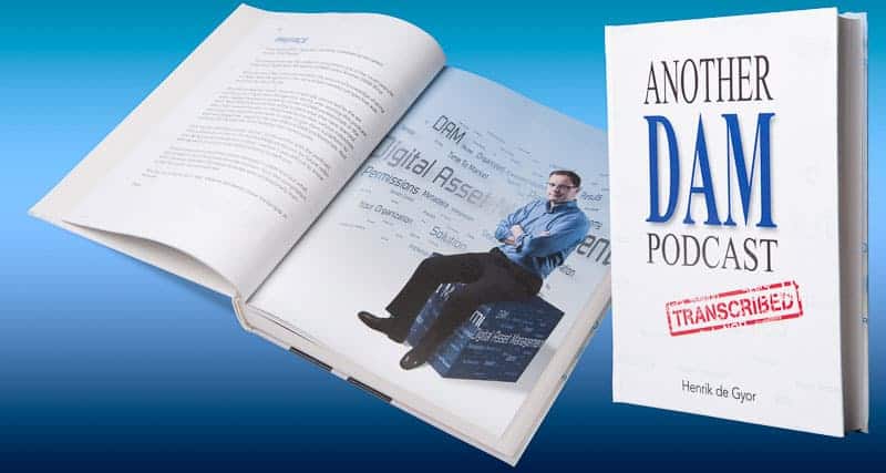
Henrik de Gyor, host of Another DAM Podcast and Another DAM Blog consulted MGC to do a couple of corporate portraits for an upcoming book he was writing called “Another DAM Podcast Transcribed”. The purpose of the book is to be a resource for individuals interested in or involved in Digital Asset Management. Readers can learn and enrich their own knowledge with over 85 interviews with Digital Asset Management professionals. Sometimes they are known as DAM managers.
I hear you snickering out there wondering what the heck a DAM manager is. A DAM manager is someone who manages all kinds of digital files so that they can be tracked, acquired, purchased, sold, and shared amongst agencies, departments, both internal and external stakeholders. A good example of a DAM and something we can all relate to would be a stock photo agency that has photography, video, audio, and graphic files available for licensing. Private citizens, companies, and agencies log into these resources and conduct searches for specific keywords that meet the criteria for a project they are working on. For example, someone might search for “African American couple in house, no facial hair” and then get a narrow or wide selection from which to choose.
 Managing these files (also called assets) means each and every file must contain metadata (information about the file that is hidden within the file itself) that can tell other DAM managers or stakeholders what is in the file without actually having to open it.
Corporate Portraiture

Photo shows a typical executive portrait in front of a calm, simple background.
As a corporate portrait photographer, I like to photograph my subjects in two manners when given the opportunity; Shown in this paragraph is a headshot in front of a calm background and another in the environment they work in. Not everyone has time for an environmental portrait but I leave it to you decide, which would you rather see on a website?

The photo shows a more relaxed view of an attorney working with a client. This shows him “in action” and not just a static headshot.
Sometimes I will shoot photos of them in action doing their jobs like the photo at right. For this “DAM” project, however, I really felt it needed something more. I had to figure out a way to connect the photo of Henrik with “DAM” in a seamless way. Understanding the concept of digital asset management gave me the opportunity to offer Henrik something more than just a head-and-shoulders portrait. Understanding this gave me the ability to offer him a lot more—a photo illustration.
Image Concept
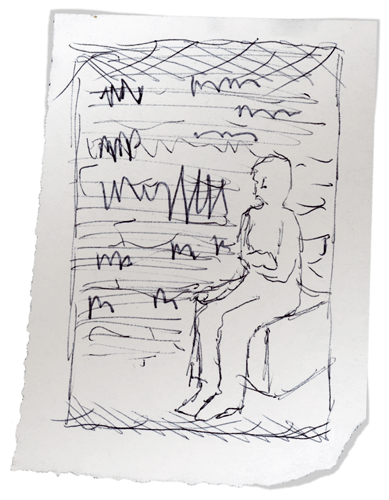 I started with simple sketches on paper and showed them to Henrik over coffee; he immediately got excited about the idea. The concept was to have a full-body, medium shot and close-up of him in front of a word cloud filled with DAM terminology. I give him an estimate for the additional time and the project was underway. Henrik writes:
“The concept was a great idea. It was so much more than a simple portrait. Mark did an amazing job conceptualizing an environment with references to Digital Asset Management.”
Photography
So the next step was to photograph Henrik. Being a student of “doing more with less”, I set up a make-shift stool for Henrik to sit on in the largest space I have in my house, my TV room and had him attempt to relax on the two wooden frames I clamped together.
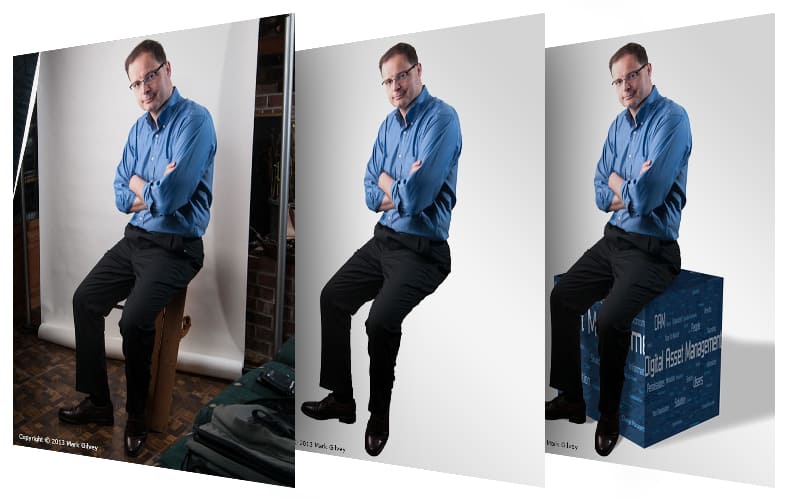
It’s important to note that I was photographing him for a photo composite I was going to make and not a single-got-it-in-camera-and-it’s-done photograph. If you are asking yourself why he doesn’t have a soft dappled-painted background, it is so I would be able to make a clean mask of him in post-processing and extract him from the background.
For the lighting, I used a large softbox (a fabric box with a flash inside) and short-lit (lighting that comes from a specific direction in relation to the subject’s face) him with a second bare strobe opposite the main light; a very simple setup. Using this setup I shot several frames of Henrik making various expressions. I don’t like to shoot a lot of frames; I shoot enough. I don’t believe in shooting endless amounts of shots unless it calls for it or an art director is looking for something specific and even then, we would know it when we see it. I prefer to have a shot like this planned out in advance.
Post Processing
After Henrik left, I offloaded the files to my computer and worked on the color and sharpness as a starting point. Then I made a contact sheet that would allow Henrik to review his expressions and emailed it to him for review. After his review, I moved forward on three images he selected. A photo of him sitting, one where he’s standing and appears to be leaning on a wall, and the last, a close-up.
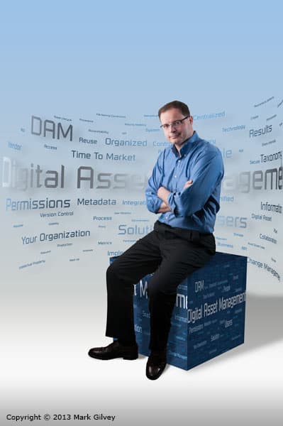
The most important image (and most difficult) to build was going to be the composite of him sitting on a cube in front of a wall of DAM terminology.
Retouching
I closed my eyes for a moment of meditation and pre-visualized the final result, then I went to work. The first thing I needed to address were some of the, uh, imperfections that “the author” wanted me to remove and push in as well as a few distracting folds on his shirt. After completing this clean-up phase, I moved onto masking. I needed him off of this background and with as much edge detail as possible. In the old days I would have used a combination of the pen tool and channel masking to extract him but the newer tools in Photoshop, made it take much less time. Once he was extracted from the background, I could begin working on the background elements.
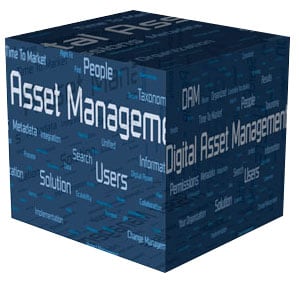
The second most important thing I needed to add was the cube. The cube, at the beginning of my thought process, represented a single asset. Creating this was going to be more difficult than I thought because I would have to match it to the angle and distortion of the camera lens. I started by extruding a box and angling it slightly. Initially, I had it extend completely off-page as if it was a very tall box. Henrik suggested that it might make him look like he was too much “in the clouds” and suggested just using a cube. I liked this idea for several reasons; it brought him down to earth and a single cube could be representative of a single podcast or a single asset or it could be broken down into many tiny cubes each representing a single podcast. I believe less is more, we went with a single large cube to replace the make-shift stool he was sitting on.
I placed it below his now extracted body and added a gentle blue gradient behind him and a shadow on the floor being produced by the cube (see the third image in the composite above). The composite was coming together nicely but it was still missing something. It was missing…you guessed it; the DAM word cloud.
I knew that I wanted a word cloud of DAM terms so I had Henrik make a list for me. He put them into one of the online word cloud generators but they really didn’t give me the look I was after so I decided to do it myself. Henrik had applied numbers to each term in the word cloud generator he used so I used that information to break the list down into several groups of words based on the numbers they had in common. Then I scaled each group larger as the number of words became fewer. Lastly, I colored each group a different tint of blue to differentiate them one more level. With this completed, I was able to place them all into a single file and start arranging them into a flat piece of art.
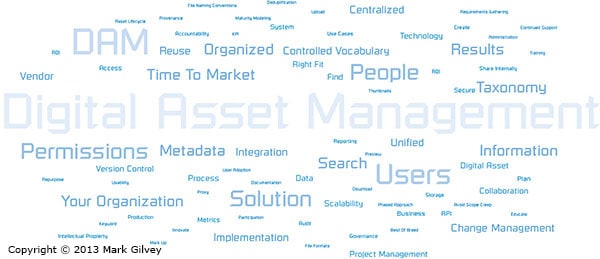
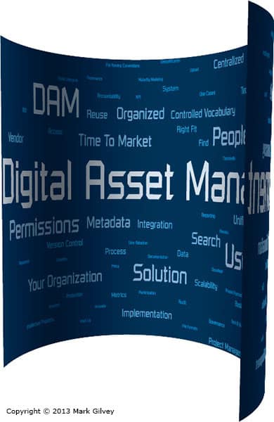 I tried placing this “wallpaper” behind the photo of Henrik sitting on the cube but it just wasn’t working because, well, it looked to flat, duh! I knew that I needed to add some depth somehow. I thought it would be neat if this wall of text wrapped around him so I mapped the flat word cloud to a partial circle that I had extruded. Unfortunately, the blue background I added gave the words too much contrast and drew too much attention away from Henrik so I removed the blue so that just the words were visible. This was working very well for me I thought.
 I added the curved wall of text behind him and it was starting to come together but the blue in the words still didn’t look right. So I added a highlight to the words and gentle silver shimmer to give it a light but techy feel to it. It was really looking good now but it was still missing something.
I thought about what an individual asset is; it’s something that I might not be able to identify without having information or metadata about it. After discussing this with Henrik, we decided that the word cloud could also be used in the cube as if it were a form of metadata. That was the last thing it needed.
 Portraits
For the medium and close-up shots of Henrik, I thought it would be better to keep the word cloud theme going so I extracted him from those photos and placed those elements over the blue gradient with the word cloud. I now had a group of photos and elements that all worked together and could be dissected into separate parts and used in different places throughout the book.
For the book, I used some of the elements like the cube and the word cloud to make section dividers—this helped bring everything together.
Mission accomplished.
Photography Reflections
The only thing in the photography I think I would like to has spent more time on where the additional folds on his shirt and pants. I didn’t have a “sky’s the limit” budget for this so I had to stop retouching at a reasonable point. I wonder if it would still look natural if I had gone further.
Project Time
Photo Work: Photography, ingestion, level 1 post-processing, contact sheet export/deliver, make concept sketches, level 2 post-processing and mask key image. 5 hours.
Photo Illustration Work: create a word cloud and 3D art, create a cube in 3D, create a composite in Photoshop combining gradient, word cloud, cube, and author. Mask medium and close-up photos with word cloud art. 6 hours.
* I have two levels of post-processing, the first step is to optimize the photos so the client can get a clear idea of what each image is through exposure and color correction. The second level refines on this with local corrections and other more refined enhancements.