Quality photography matters in marketing!
Great photography can take a business’s marketing materials from just getting by to wow! Business owners who understand the value of good photography realize that it’s more than just a matter of pointing a camera phone or the family DSLR and pushing a little button.
Introduction
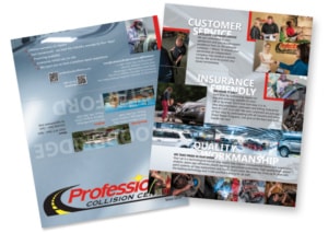
My design partner, Sherri Arnaiz was working on a promotional tri-fold mailer for an auto collision repair shop in Woodbridge, VA called Professional Collision Centers. Sherri had done a nice design for them using stock images and some photographs supplied by the client. When the client looked at a proof, they decided they needed new photography with more drama and excitement.
Sherri suggested they take a look at my portfolio. Since they were going to the expense of getting a new brochure, they decided to invest in new photography. Sherri and I were thrilled they were committed to the project.
ESTIMATE
All projects start with an estimate. The client was excited to get the project started so I had to work out all the details before ever pressing a shutter button. They had locations in Stafford and Woodbridge, Virginia that we wanted image content from each. Sherri was art directing the project and had a worked up a nice list of shots she wanted to make sure we had for the brochure and for other uses. The first thing was to make sure we had similar shots from each location. We worked out the following list:
- Owners (one at each location, always good for customers to recognize who is responsible)
- Exterior photos of each building (good for customers looking for the building from the street) and a customer with an estimator
- Interior photos of the nice waiting area, happy customer, the different types of work performed on vehicles; grinding, sanding, welding, painting, assembly, dent removal
Does that sound like enough? This was going to be a lot of great work but would be difficult and time consuming for the client if I did it solo so I called in a photo assistant and Sherri art directed so we would get just the right shots.
Let’s go!
EXTERIOR PHOTOGRAPHY
The exterior architecture photos would have to be done when mother nature was in the mood. There had been a lot of rain at the time and the grass had grown. I reviewed the locations on a map to see what direction the face of each building pointed in relation to the position of the sun.
I went to the Woodbridge location when the sky had a few clouds in it but just as I arrived, it clouded up. I took some photos of it anyway but later realized the cloudy sky, in this case, looked “angry” and I didn’t think that was the right idea to project.
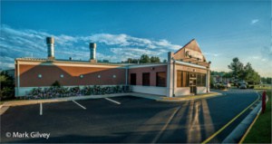
Early morning photo of Woodbridge car repair facility shows the front of the building in vivid detail.
I went back on another day when the sky was clear and got much better photos of it. With the sun coming in at an angle to the front, the light revealed more texture in the face of the building which I wanted to add additional enhancement to later in post processing. Then more rain began to downpour so I had to wait another day to photograph the Stafford location.
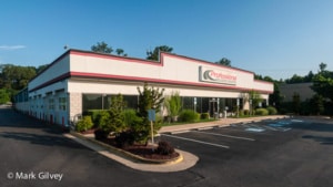
A few days later I drove down to the Stafford location and took some shots as the sun was setting. I decided to shoot in the evening after looking at the position of the building on Google Maps. I also use an app called Skyview which will show me where the sun will be at any time of the day and its path. This helps because if there are a lot of trees in my view, I’ll know what time the sun will be above or below them.
INTERIOR PHOTOGRAPHY
The interior was going to be a real challenge and require nearly the full gamut of photography I do. I had interior panoramic architecture, corporate environmental portraits, action shots and photos of their services to do. Sherri art directed the Woodbridge shoot. She has worked with many photographers and is always quick to catch things that could be missed. The two of us really work well together and the final product is always the better for it.
One of the main things that Sherri was after was motion and action. She wanted more than just snapshots of employees doing work. The staff at Professional collision are talented technicians, skilled craftsmen in their own right. So, I wanted to show them in action and get the movement Sherri was after. Through careful lighting and available light, I captured multiple images and in some cases combined several to produce the motion effects you see in the following photos.
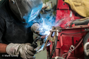
Everyone likes to see sparks and smoke but to capture them together is difficult. This is where having a photographer who is also a photo retoucher can add the best parts from several frames.
For the welding shot, we wanted to capture the bright intensity of the weld, the smoke, and especially the sparks and the glow off the hood. I use studio lights to provide a soft natural looking light while the light from the welding torch becomes the main light. The rest of the scene was lit with available light.
The painting booths were really important to the owners. They had one at each location. The original idea was to get a photo of the entire booth with a car being
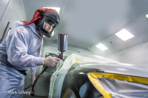
Most services can be photographed. Even if you don’t think they would make a very exciting image, they can.
painted. When clients ask for specific image, I always indulge them because they have a very specific idea in mind and it is very important to them. If there is time, I will then take it to another level. In this case, what I really wanted to do was bring the viewer into the booth. I wanted them to be able to smell the paint. Before I could do that though, I had to gain some confidence that I or my equipment would not be covered in paint. I stood near the paint tech as he made a couple passes with the spray gun. I was unprotected and despite that, the ventilation clearing system sucked the over spray out so well, I picked up my camera and started shooting.
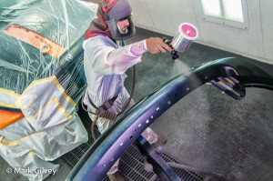
Another view of how an image can go from not-so-exciting to dynamic. Getting interesting viewpoints are key.
At the Woodbridge center, they had another spray booth. This time, Sherri asked me to try and capture more of the spray. In order to really emphasize it, I got up high so the camera would be closer to the spray. I had to work the image a bit more in post processing in order to bring out the cloud that came from the over spray. The second thing that was important to me was getting light on the tech’s face so I positioned my studio strobe in front of him and balanced the lighting with the bright ambient light from within the booth.
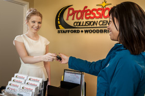
Showing a customer satisfied with your service is a very important image that helps create a sort of “closure” to your brand.
Another important photo that Sherri wanted was of a happy customer receiving the keys to their car. We staged this scene using the receptionist (left) and one of the account managers (who played the customer). This photo was more complex to stage because of the multiple studio lights I used to bring out the detail in the hair and provide separation between the background and the subjects. You can even see the some light modeling on the logo which, one might think is part of the same shot but in reality, it was a separate shot with light going on just it . Then the photos were combined. Sherri was quick to point out the door being open in the background but I had to have it open so the light that is falling on the receptionist shoulder had a place to stand. So like any photo retoucher would do, I just added a door. This helped provide a large smooth area without the distractions of the black light stand, open door edge and the view inside the room.
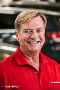
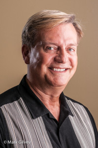
Of course a simple head shot of your leadership is important but taking a little extra time to place them into an environment instead of against a plain or pattern background could make all the difference.
I really enjoy taking corporate headshots, particularly when they are environmental portraits. The initial idea we had was to photograph each of the owners against one of the plain walls that were inside the reception area at the front of the building. I also wanted to capture their image in the environment they manage.
CONCLUSION
The photography took the equivalent of about 4 days of shooting. The post processing and retouching took another few days, but the bottom line is the client was really happy with Sherri’s final brochure. Now it really represented them because it showed them, their facilities and most importantly, the craftsman and their work. I’ll leave you with a few more photos that Sherri and I did.


